This app was created as part of my UX course project at CareerFoundry where the general objective was to enable anyone, anywhere to instantly chat with an expert in virtually any field.
Being an expatriate myself, I know that moving to a new country can be challenging and help is needed in many areas.
According to industry reports, the global expatriate population is growing and is likely to rise to 90 million by 2021.
Knowing this, I decided to design a web-based app for expatriates that often are unfamiliar with issues when moving to a new country. I want them to find quick answers to questions or get advice from an expert in different topics that can be alienating when living abroad.
PROBLEM STATEMENT
Each country and government is built differently, so when an individual moves from their homeland to a new country, they sometimes feel lost and are afraid, due to the lack of security (job, home, etc.) or social belonging (friends, lover, community, etc.) needs.
As a person living abroad with a small or non-existent network, the expatriate needs a reliable and fast way to get advice or find answers to questions amongst diverse topics. We will know this to be true when we see expats use the X-PATH app.
GOAL
Give expats back more time to explore their new country, meet new people and make sure they are happy in their new lives. By finding answers to all their questions quickly, they will save time.
I researched for competitors and noticed that there is definitely a niche market as no expert app specializes on offering help to expatriates. So I analyzed general expert applications to determine their strengths, weaknesses and give me new ideas. I also looked at their strategies to see how I could stand out in the expert market.
USER STORIES
They help me achieve clarity on what to build, for whom, why, and when. User stories are easy to define, understand, and revise, therefore, I create as much as possible. Here are 3 examples.
“As a user, I want to be able to rate my video experience with the expert, so other expats can choose from competent advisors.”
“As a user, I want to get the invoiced amount as push notification after each call, so I know how much money will be taken from my account.”
“As a user, I want to see my past and upcoming calls, so I have an overview of my activities.”
USER RESEARCH
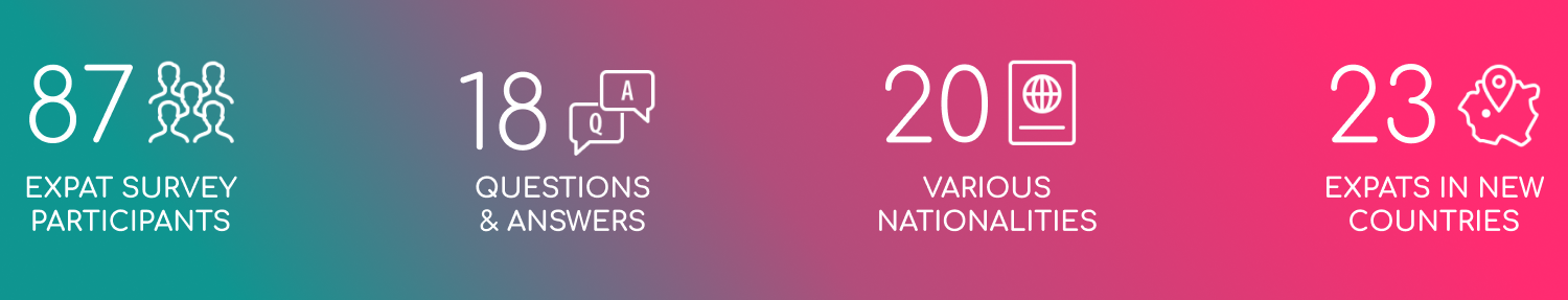
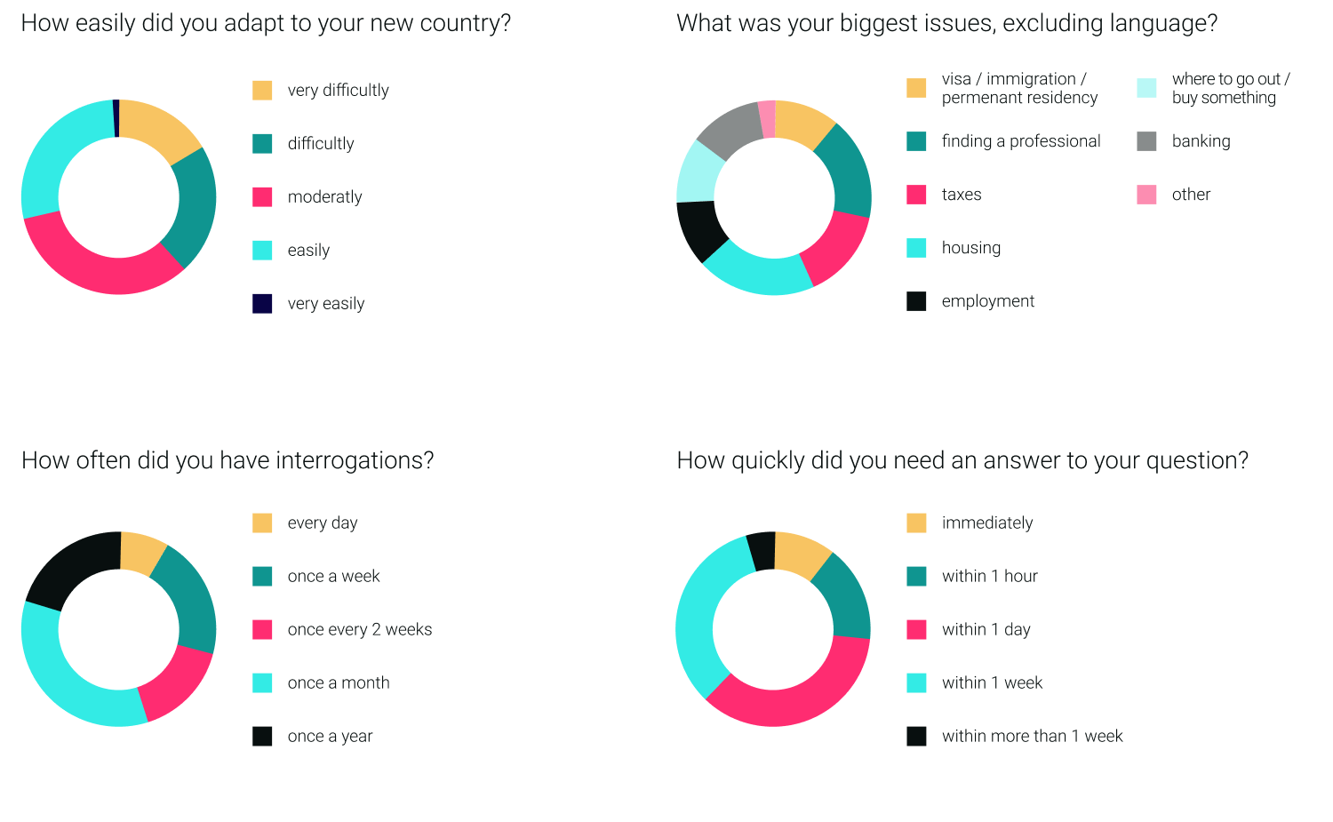
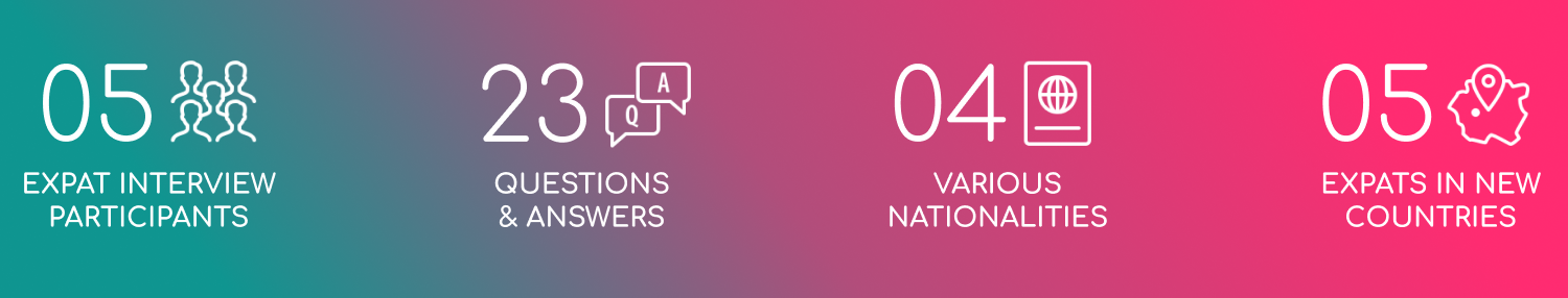
I gathered valuable feedback from expats all over the world. I conducted both qualitative and quantitative user research by setting up a survey and also interviewing expatriates. I engaged with them and got to know their needs, behaviours as well as pain-points in relation to their lifes as expats.
USER RESEARCH ANALYSIS
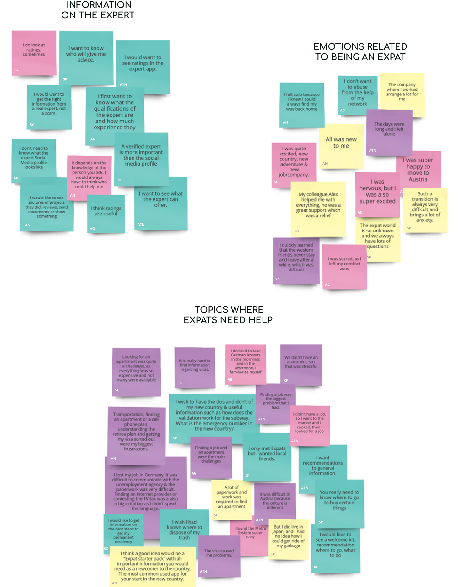
Evaluating the answers of the users brings me 1 step closer to building my user personas. Using MIRO, I organized the data from my interviews onto 4 different post-it colors, clustering the information into behaviors / attitudes (pink), needs / goals (turquoise), frustrations (purple) as well as worth mentioning quotes (yellow). Then I clustered the colorful notes which were labeled by interviewee in interesting findings and insights.
USER PERSONAS, EMPATHY MAPS & USER JOURNEY MAPS
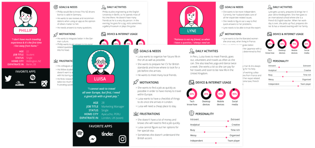
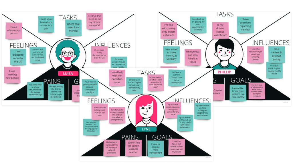
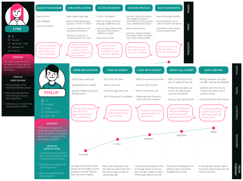
My data groups quickly converted in 3 different personalities. Let me introduce you to Phillip, Lyne & Luisa. They helped me establish empathy with the users and make design decisions which are based on real data from real users. I also created empathy maps to understand the users even better, especially how they feel. Lastly, but not least, I developed user journey maps, giving me new ideas. I thought of goals each persona could accomplish while interacting with the application.
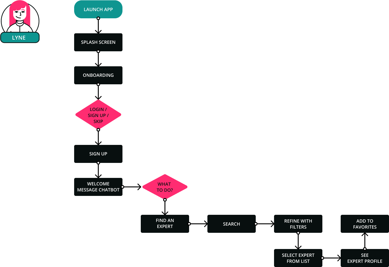
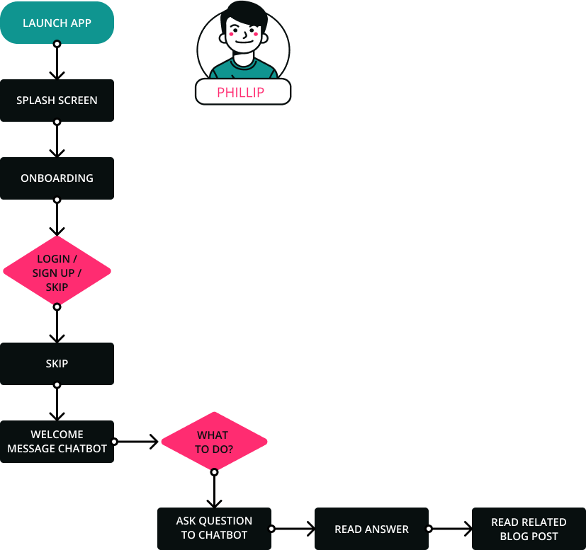
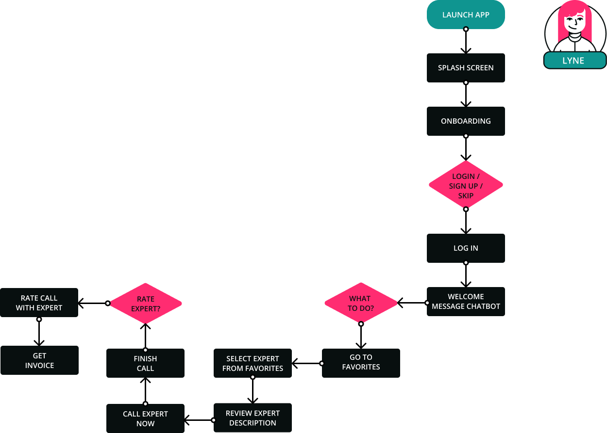
USER FLOW CHARTS
Next, I reflected on which steps the personas would take to achieve a goal or complete a task with the X-PATH app. This helped me envision how someone could navigate the site with 1 specific objective in mind.
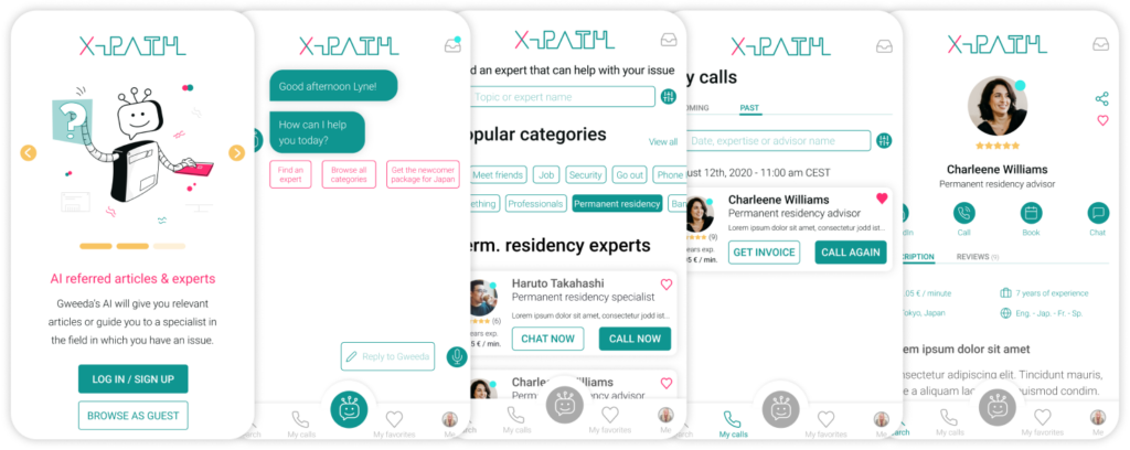
In this example, Lyne wants to search for an advisor regarding her permanent residency. After filtering the search results, she adds the convenient expert to her favorite list for later.
Here, Phillip needs an answer to a question. He doesn’t want to log in nor to sign up, he simply wants he get a rapid response. So he skips registration and asks Gweeda the Chatbot. She gives him a link to a blog article and also suggests a few experts.
In this example, Lyne wants to consult the expert that she already added to her app’s favorites. In addition, she wishes to receive an instant invoice.
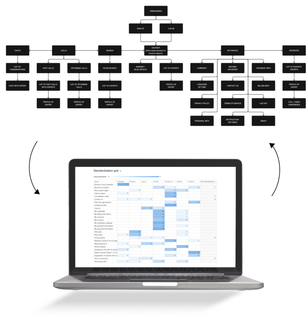
SITEMAP & CARD SORTING VALIDATION
I created the sitemap to establish the information architecture as well as the navigation structure for the X-PATH app. I choose a flat navigation as I want users to easily reach their goal. Furthermore, I validate this sitemap by asking potential users to do a hybrid card sort for me. Following this procedure, I analysed the data and made some changes to my sitemap.
MULTI-FIDELITY WIREFRAMES
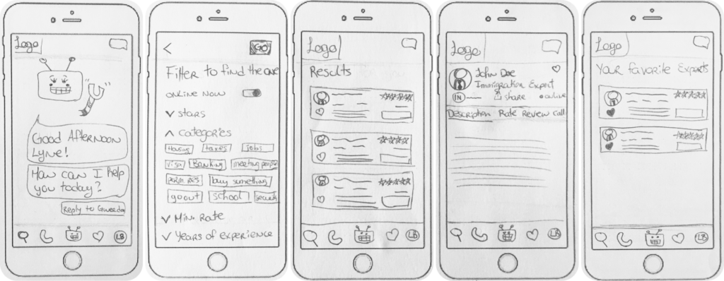
LOW-FI WIREFRAMES
In this step of the design process, I sketched out all wireframes in low-fidelity. This phase is crucial in order to valid if my ideas are realizable and make sense.
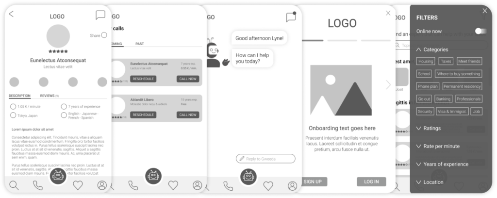
MID-FI WIREFRAMES
Here, I created a more accurate representation of the layout with more details.
HIGH-FI WIREFRAMES
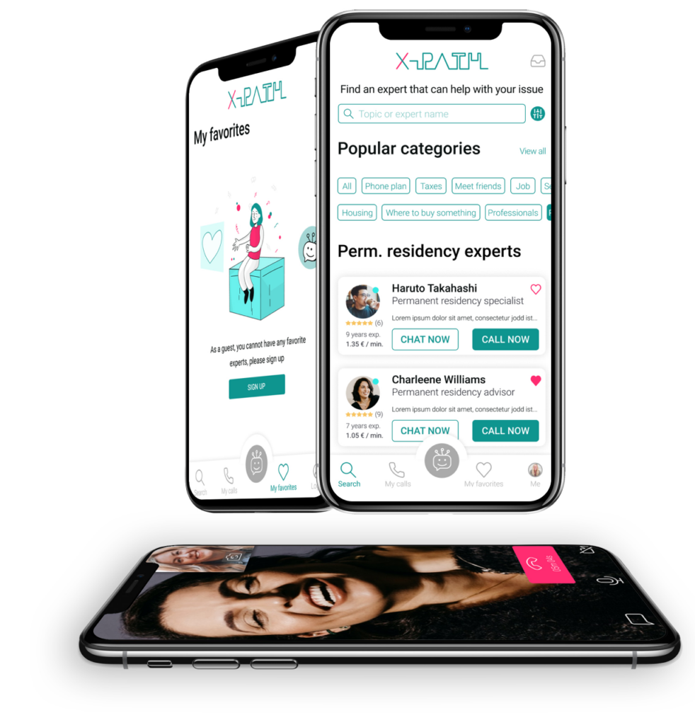
Adding color, imagery and branding make the wireframes look professional. With this the client or team can see the vision behind the app itself.
USABILITY TESTING
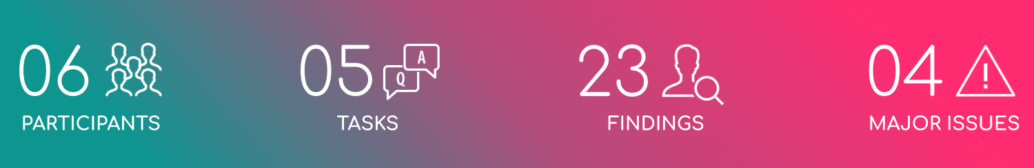
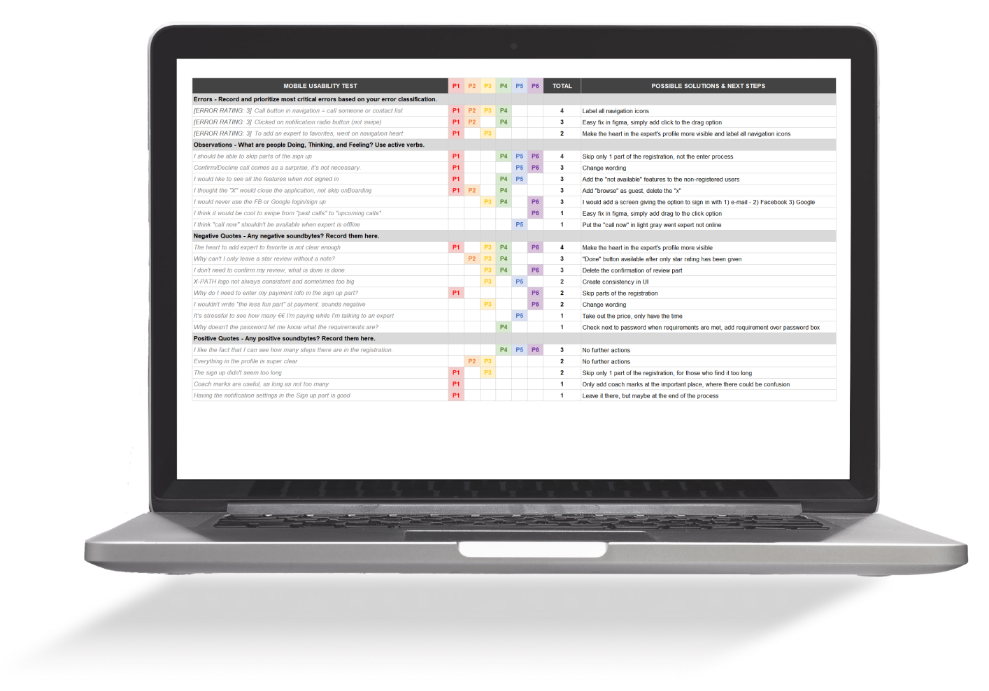
After recruiting expatriates as participants, preparing the test script as well as the tasks, and creating a test plan, I was ready for the evaluation. I wanted the testers to perform specific tasks to make sure my design decisions were valid for all users. I did the user testing remotely as well as in person and found a few issues. Furthermore, I established solutions for the problems and retested with new users.
ISSUE 1
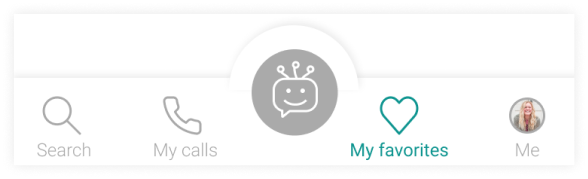
PROBLEM: Many participants were not all able to recognize the icons which didn’t have labels in the navigation.
SOLUTION: Label all navigation icons with precise wording and color to know where the users is located.
BEFORE
AFTER
ISSUE 2
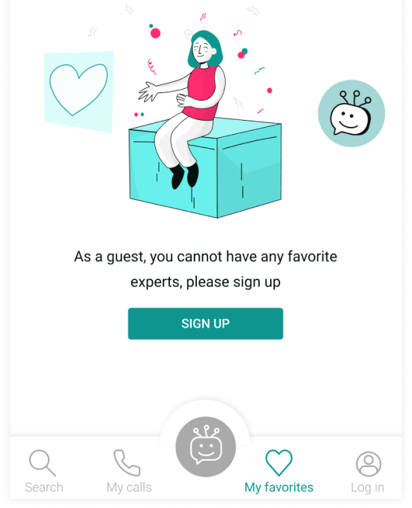
PROBLEM: When browsing as a guest, it’s not possible to see what the entire app has to offer.
SOLUTION: Make all features clickable, linking the user to the empty state screen that encourages them to sign up.
BEFORE
AFTER
ISSUE 3
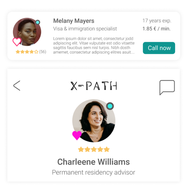
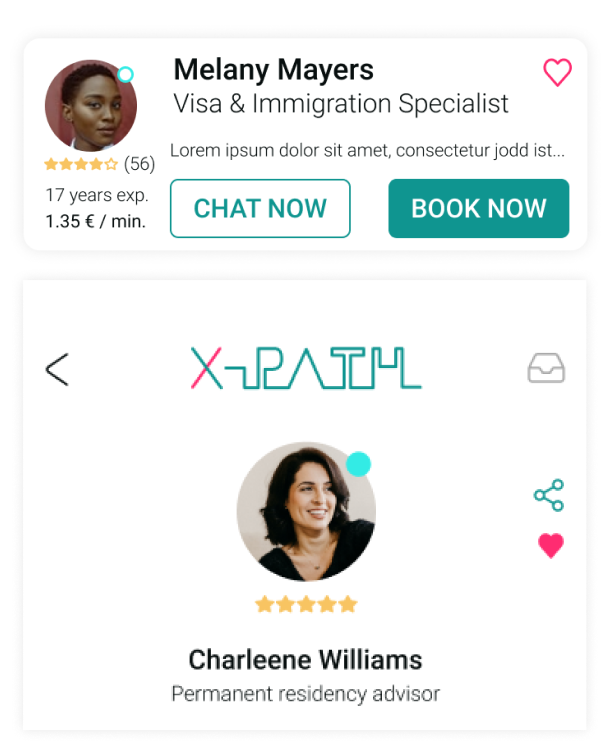
PROBLEM: More than half of the participants found the like/save button too hard to locate.
SOLUTION: Change the location of the heart icon in the profile in order to add the expert to the favorites.
BEFORE
AFTER
ISSUE 4
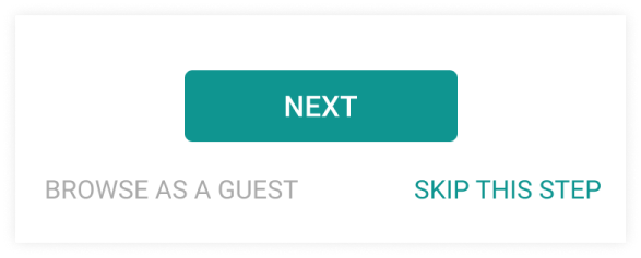
PROBLEM: Some participants mentioned wanting to skip parts of the sign up process. All questions were valid and not too long, but sometimes, it’s good to be able to skip a step.
SOLUTION: Add a skip button in the sign up process, so users can skip 1 or a few steps.
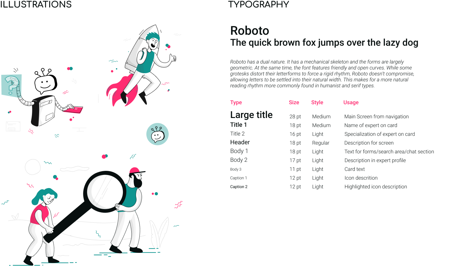
It’s important for me that the user has a great experience while browsing through a product and the UI part is as valuable. I chose to keep the interface clean, with fresh colors and consistent illustrations.